This is a design skills experiment for my ‘IT Professional Skills module
The ability to create wireframes and mockups can prove to be an important skill for software developers. Being able to plan and communicate your vision for an application is central to maintaing a user interface people will enjoy using.
For this module, I was provided with a brief application outline for a student app for accessing information about timetables, grades, current modules, etc.
If you’ve read my previous post where I briefly touch on my experience using Inkscape, you may have caught a glimpse of a work-in-progress mock-up I was working on:

While I’ll leave the debate to usability experts, I must admit not to have fully bought into the current trend for flat user interface elements. However, I believe consistency, where possible, is important and I’ve designed my application to fit in with its peers. This also affords me the ability to gather inspiration from the applications I use day-to-day, such as Android’s default Contacts program. It sports a simple design comprised mostly of text and colourful icons, which is something I’ve tried to emulate.
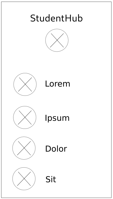
The main page is comprised of the student user’s photo and a simple list of categories to navigate to. These could be timetable information, a map of the campus, module information and so on. Each clickable element is accompanied by a large, round icon. Ideally, the icons should be colourful and instantly recognisable, e.g., a stylised grade for the grade page.

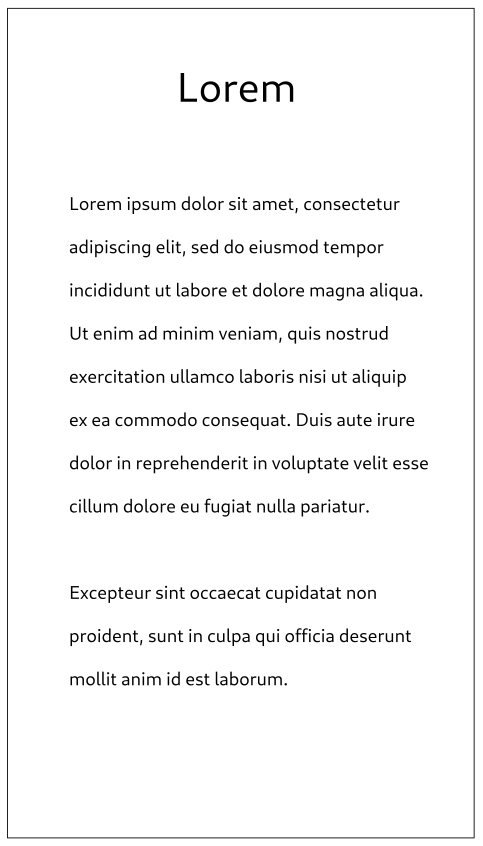
Each sub page should follow the same basic structure as the main page. For instance, the above mock-up shows how an information sub page may look. It has a large, minimal heading above the text. More complex pages, such as the timetable, should follow the same structure adapted to their own needs.
Working through an application’s design like this before any programming starts ensures that you remain focused on specific tasks and can work through potential issues before you spend hours programming down a dead end.